Brief
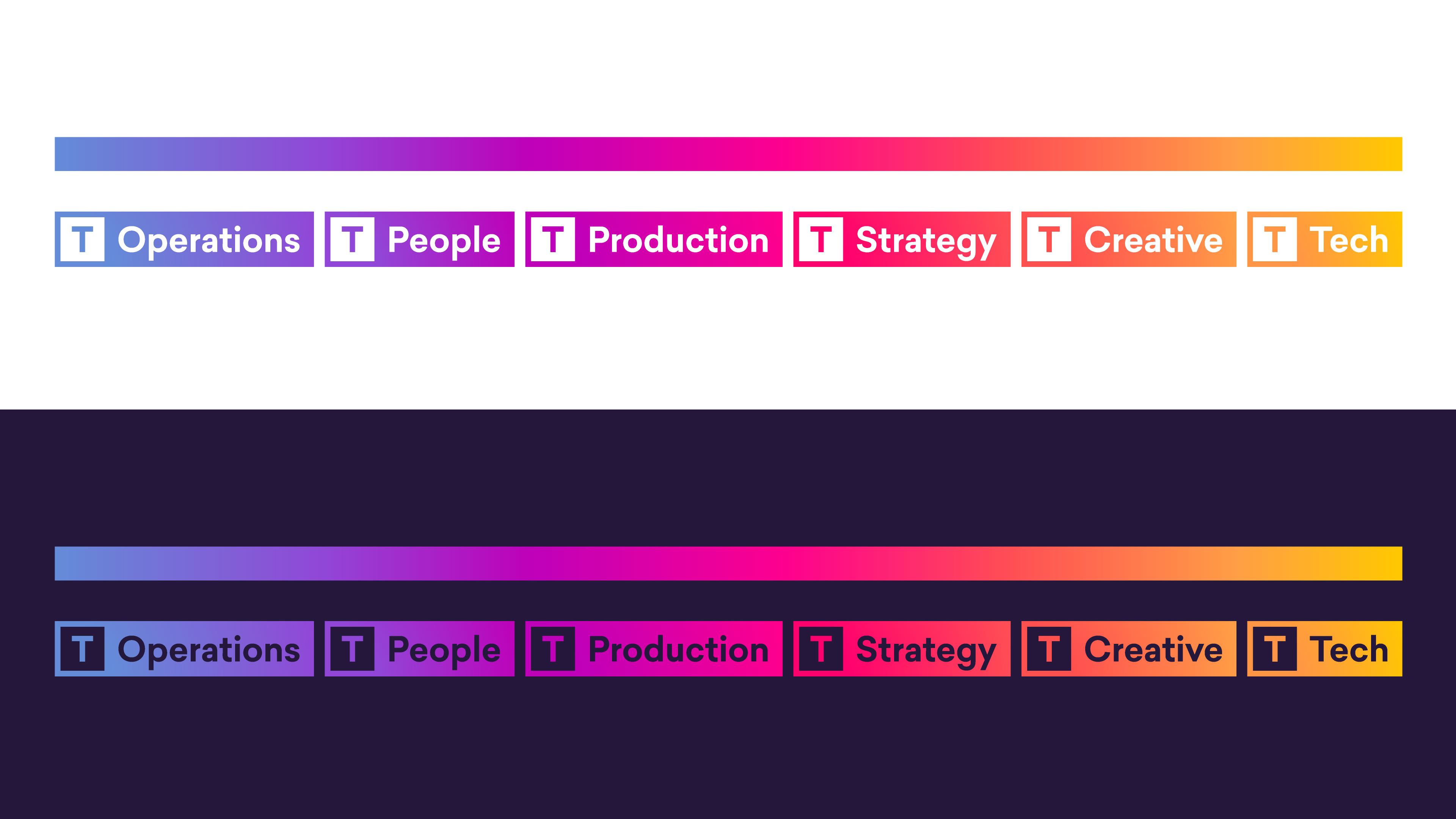
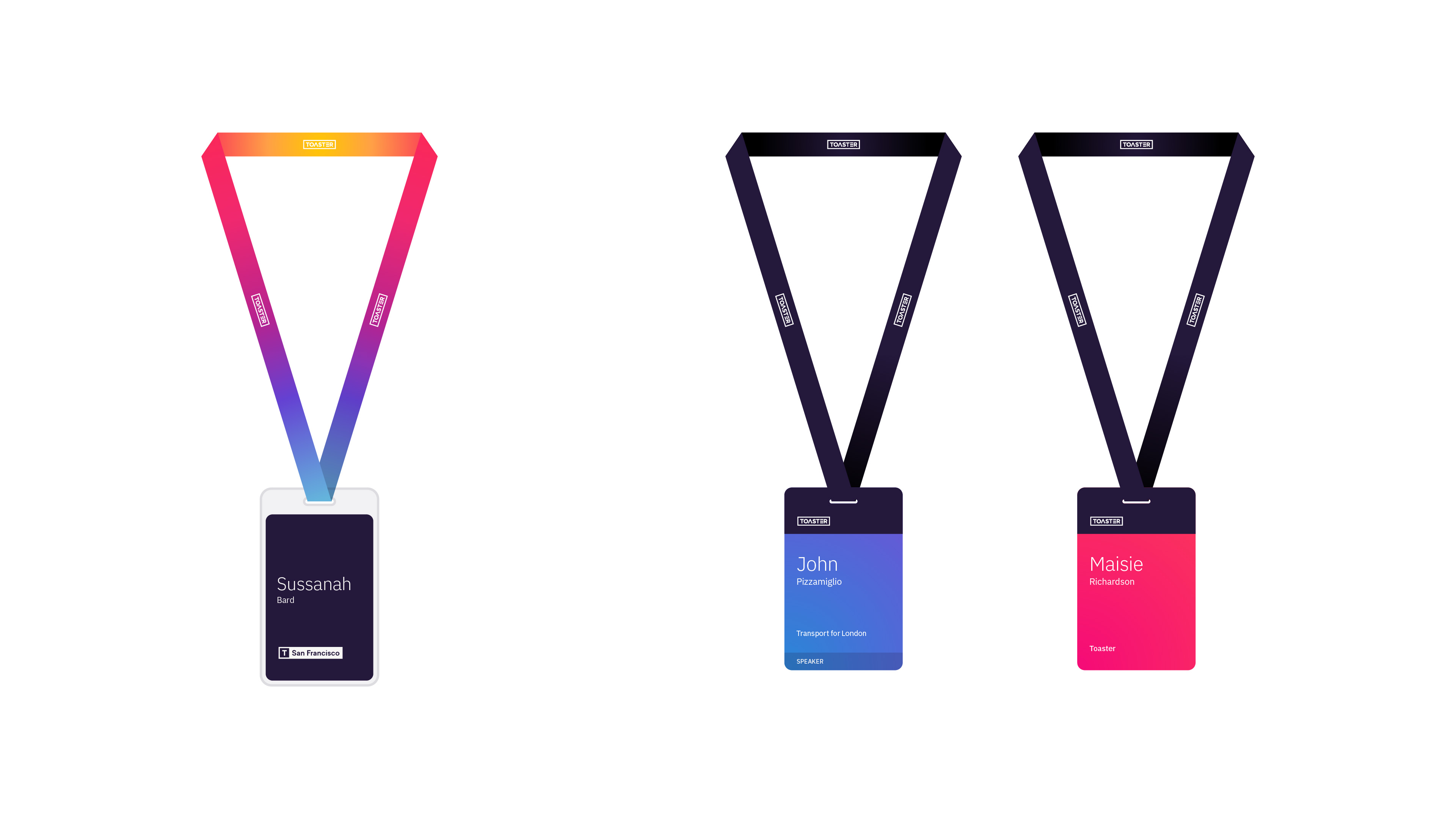
A self-imposed brief that the brand needed more colour, but a wider acknowledgement that the agency needed to start a more robust internal comms strategy. This meant that departments and regional offices would need their own ways of identifying themselves.
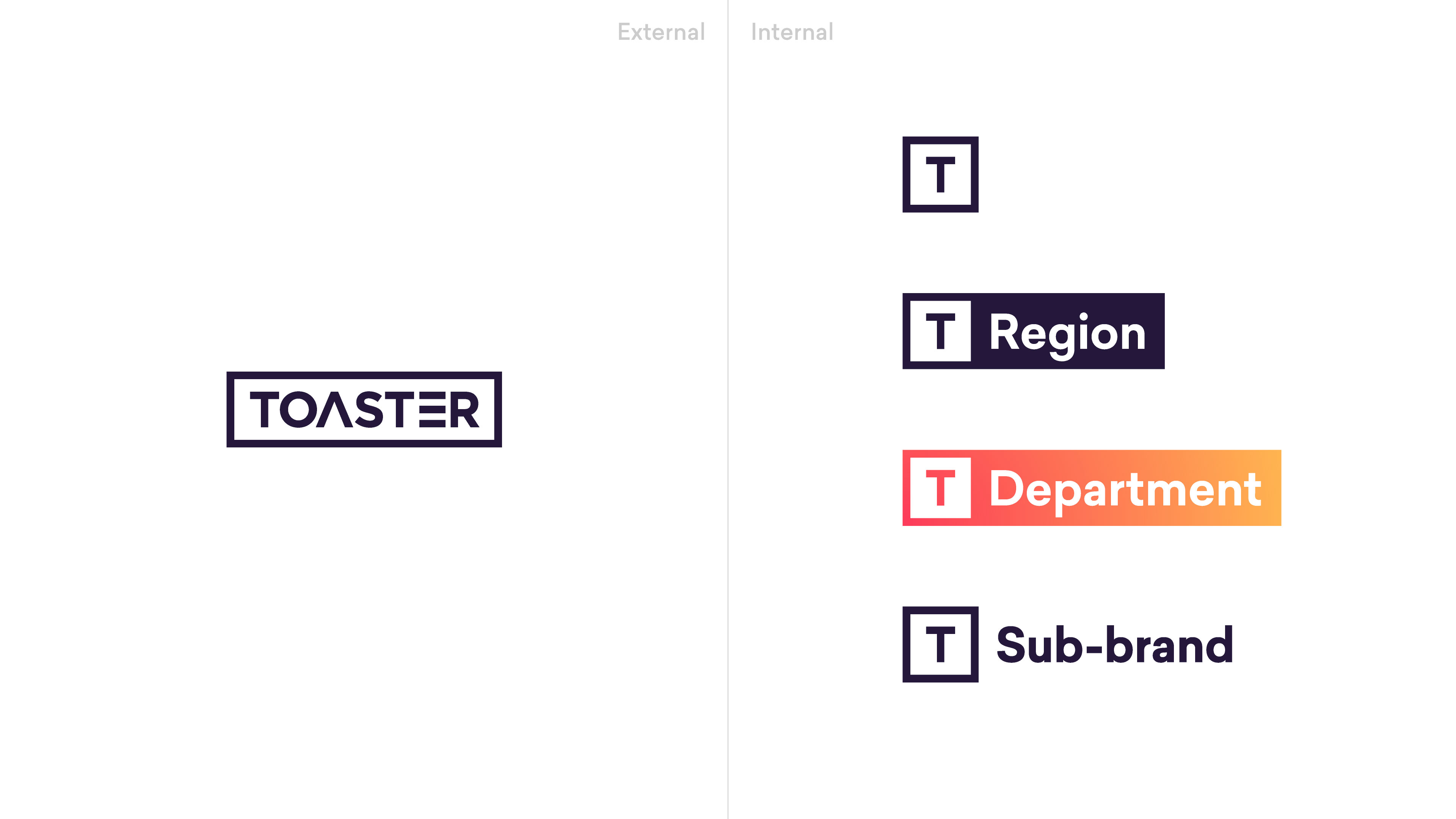
The intention was to have the main wordmark as the only external-facing logo, with a series of sub-brands reserved for internal usage.
The need for departmental specific identification became a little more necessary as the agency grew and there was a need for more departmental specific documentation and process. To create a sense of identity, yet unity within the wider brand, I proposed the use of a gradient which each department would occupy a range of. This was part of a wider gradient, which could be further broken up for use elsewhere in the brand.